#MyHouse Room Reveal, Part 2
SUNROOM, POWDER BATH, BUTLER’S PANTRY & MUDROOM
Welcome back! I’m so thrilled that you’re here. Today we’ll tour the rest of my downstairs which includes my sunroom, powder bath, butler’s pantry and drop zone. These rooms serve as a lot of the support and overflow spaces for the home. If you missed Part 1, check it out here. Now, let’s go…
SUNROOM
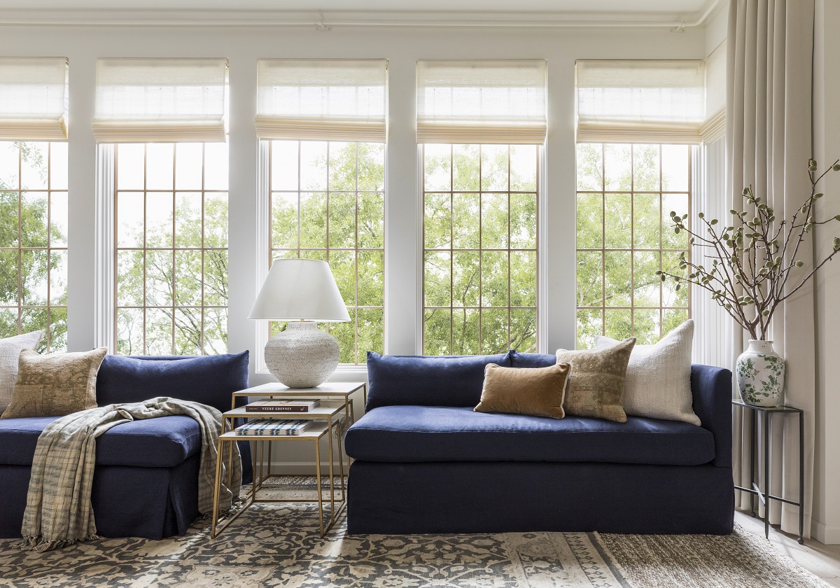
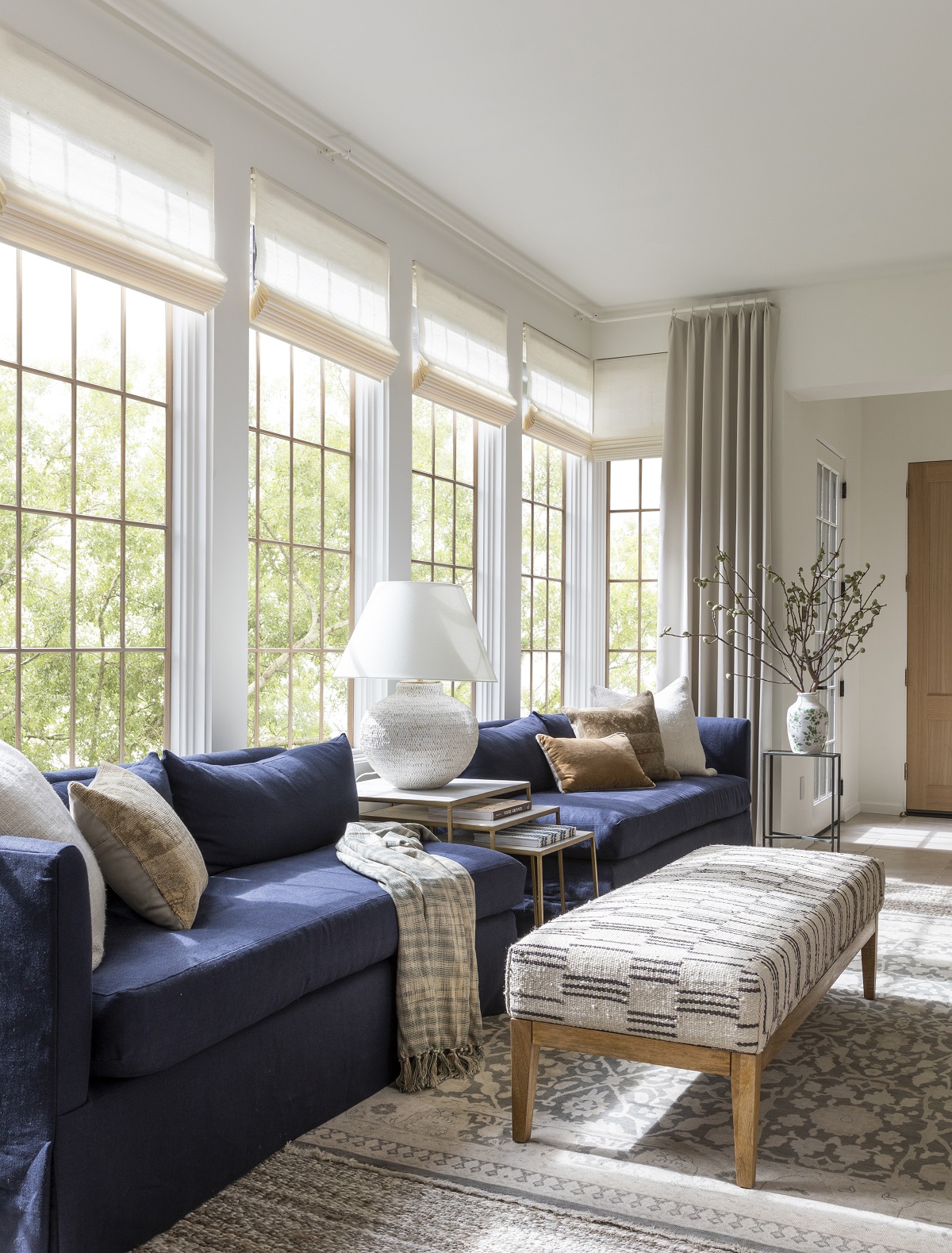
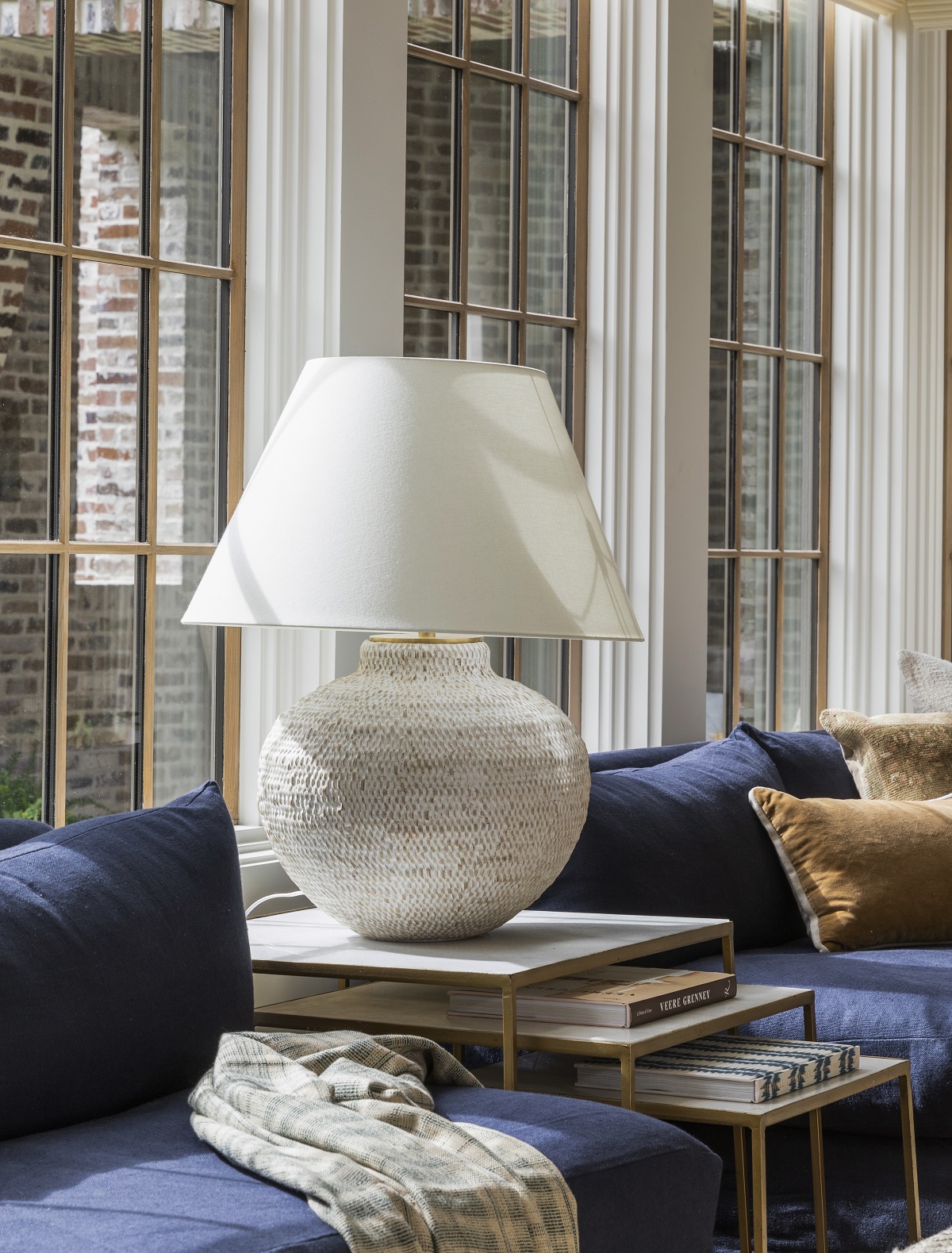
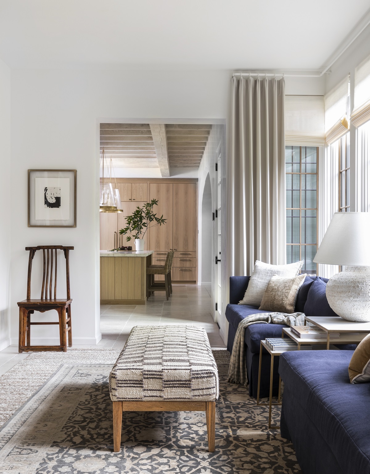
Let’s be honest, when a lot of us get home, we’re typically walking in through the back door loaded down with book bags, sports gear and everything else that comes with kids. That said, I knew when I walked into my home, I wanted a bright and airy space that lent itself to organization. The sunroom is also the conduit that takes you into the open kitchen and living room so it needed to set the tone for design while offering a beautiful transition between spaces. I also wanted this space to serve as additional entertaining space, but with added function. A set of custom sofas sit in front of the windows. I love the punch of color that the deep blue adds to the space. The woven wood shades from Hartmann & Forbes are the exact same as those in my living room. For additional texture, I included a few different pillow groupings and layered two area rugs. I get lots of questions about layering rugs and it’s such a beautiful way to add interest, depth and comfort while truly defining a space. My tip is to include a larger flat weave rug as a base layer and then pair it with a slightly smaller rug with added color and pattern for the top layer.
The most important piece of the space’s function is the wall of built-ins that add thoughtful storage to my home. The built-ins are the same stained white oak as the kitchen, but you’ll see that the front panels are noticeably different. I chose a gorgeous wallcovering from Mark Alexander for additional interest. I love how this detail differentiates the space from the kitchen cabinetry, while still keeping the aesthetic streamlined. In a few weeks, I’ll show you how I organized all of these spaces with my friends from Neat Method. More on that later…
Design Takeaway: Conceal, conceal, conceal! Similar to my dining room in Part 1, don’t let good wall space go to waste. I knew my family would need additional storage and this wall was the perfect space to do so. If you’re thinking of adding built-ins to a space, what type of storage are you going to need? I love the idea of concealing a tv or creating a craft closet in built-ins. Get creative!
Design Sources:
- Rug: Marie Flanigan for Annie Selke, Lewis Woven Jute Rug
- Rug: Antique
- Sofa: Custom
- Pillows: Marie Flanigan for Annie Selke, Gehry Pillow in Caramel, Antique Tapestry Pillows, Marie Flanigan for Annie Selke, Griffin Pillow in Ivory
- Throw: Marie Flanigan for Annie Selke, Lorfield Throw
- Bench: Marie Flanigan for Annie Selke, Leni Pewter Blue Freida Rug Bench
- Nesting Tables: Area Houston
- Lamp: Marie Flanigan for Visual Comfort, Avedon Medium Table Lamp
- Wallcovering on Built-Ins: Mark Alexander Papier Honey Natural Wallcovering
- Hardware on Built-Ins: Rocky Mountain Hardware, Zeppelin Cabinet Knob in Silicon Bronze Light
- Drapery: Mark Alexander, Lexington in Plaster
- Floors: Material Bespoke Paloma Limestone: French Quarter Finish
- Windows: Sierra Pacific
- Shades: Hartmann and Forbes, Grassweave LE3006 Essence-Shell
- Paint: Sherwin Williams, Greek Villa (SW 7551)
- Floors: Material Bespoke Paloma Limestone: French Quarter Finish
- Windows: Sierra Pacific
- Shades: Custom Woven-To-Size Grassweave
- Paint: Sherwin Williams Greek Villa (SW 7551)
POWDER ROOM
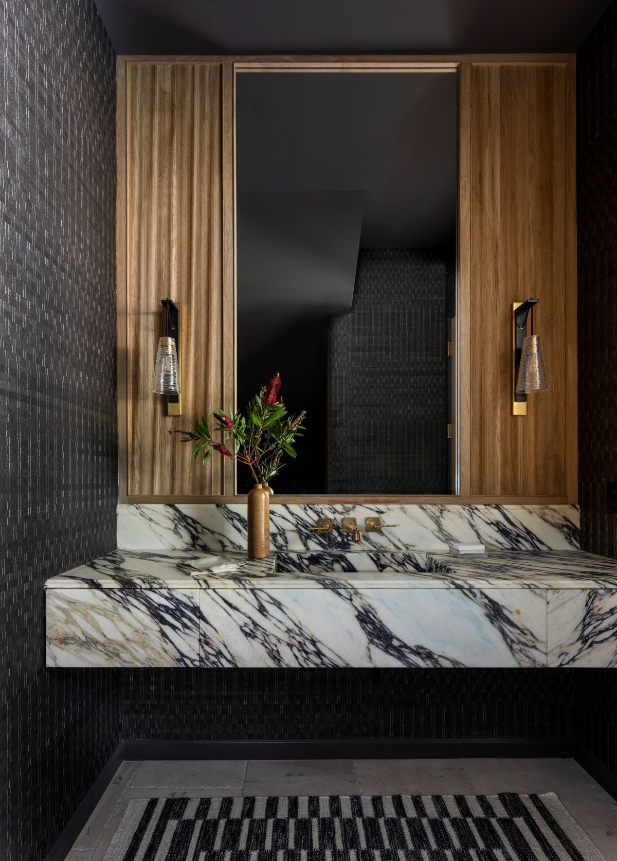
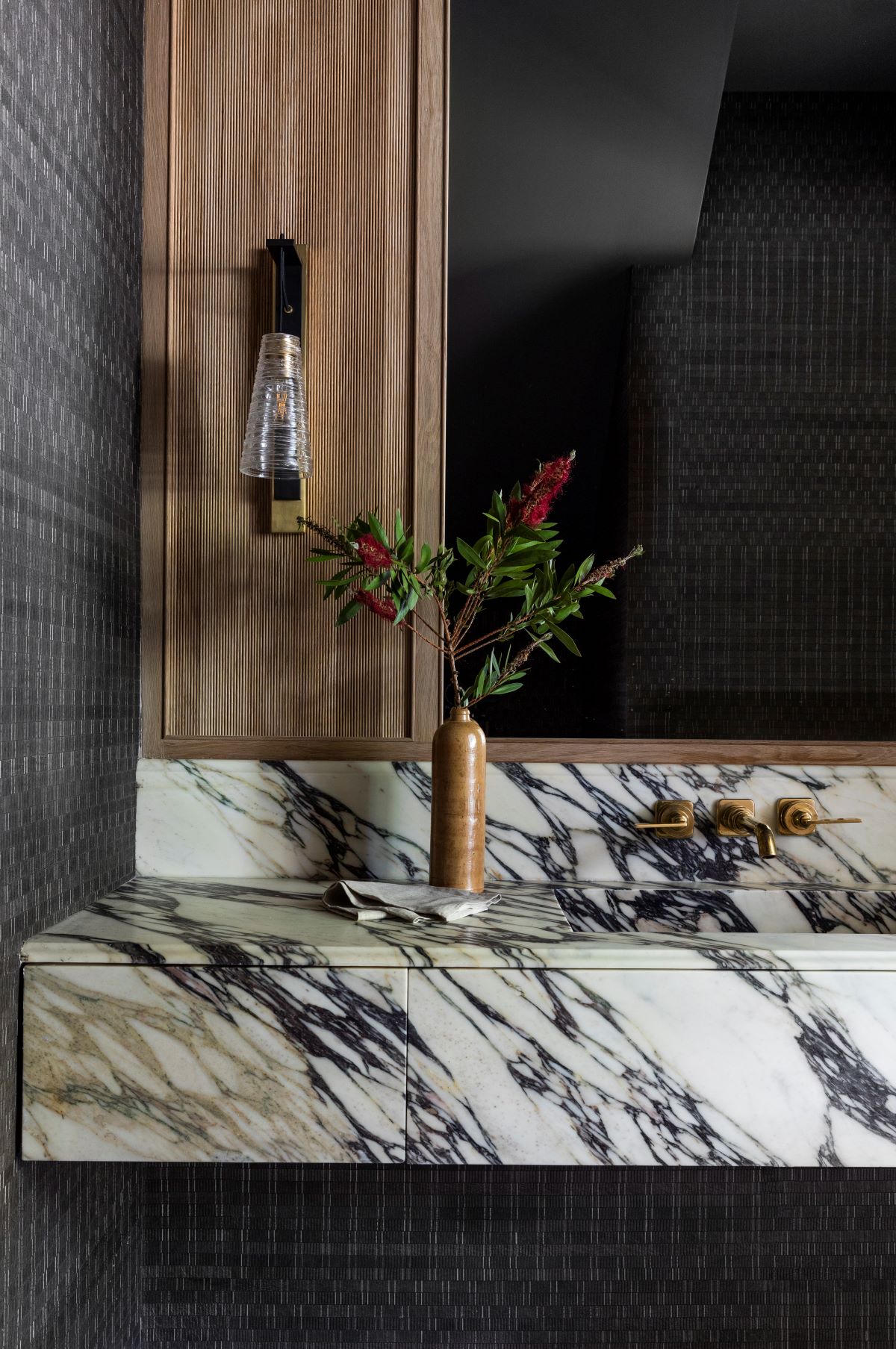
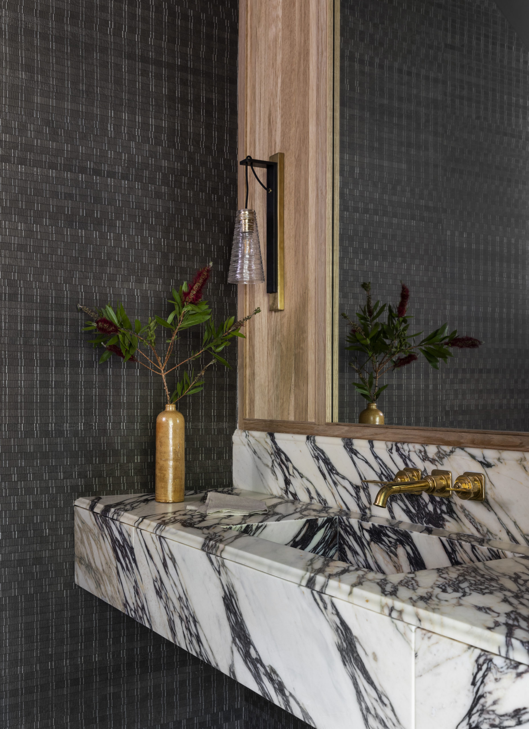
If I’ve learned anything from social media, it’s that you all love a moody powder room. I didn’t want to disappoint in my own home, so here’s my powder bath that certainly packs a punch. First, I wanted a stunning wallcovering and of course, Mark Alexander always delivers. I chose the Anagram wallcovering in Chestnut. I love that the pattern isn’t totally symmetrical which adds interest to the space, especially in a space like this one where the ceilings are very high. I also really wanted to include a stone that could add complementary movement to the wallcovering. I chose this Calacatta Viola marble from Aria Stone Gallery. On either side of the sink are push to open drawers that keep the sink looking seamless. The wall-mounted California Faucet in burnished brass gives the necessary pop of color to break up the wallcovering and stone veining. The powder bath sits underneath our staircase, so I really wanted to play up the height in this room. Since the room is dark by design, the custom oversized mirror really creates the illusion of space and light. Further, the gorgeous woodwork with fluted detail is a subtle nod to the stained wood throughout our home. Lastly, I always create my lighting designs with spaces in mind and I always imaged the Reve Conical Scone in a powder bath. This powder bath is definitely a mood.
Design Takeaway: Have fun with your powder bath design. This room should be a fun escape from the rest of your home. Take the risk!
Design Sources:
- Wallcovering: Mark Alexander, Anagram Chestnut
- Rug: Marie Flanigan for Annie Selke, Heights Charcoal Woven Rug
- Vanity Surface: Aria Stone Gallery, Calacatta Viola Marble 2 mm
- Faucet: California Faucet, Vessel Lavatory Faucet with Blade Handles in Burnished Brass
- Lighting: Marie Flanigan for Visual Comfort, Reve Medium Conical Sconce
- Floors: Material Bespoke Paloma Limestone: French Quarter Finish
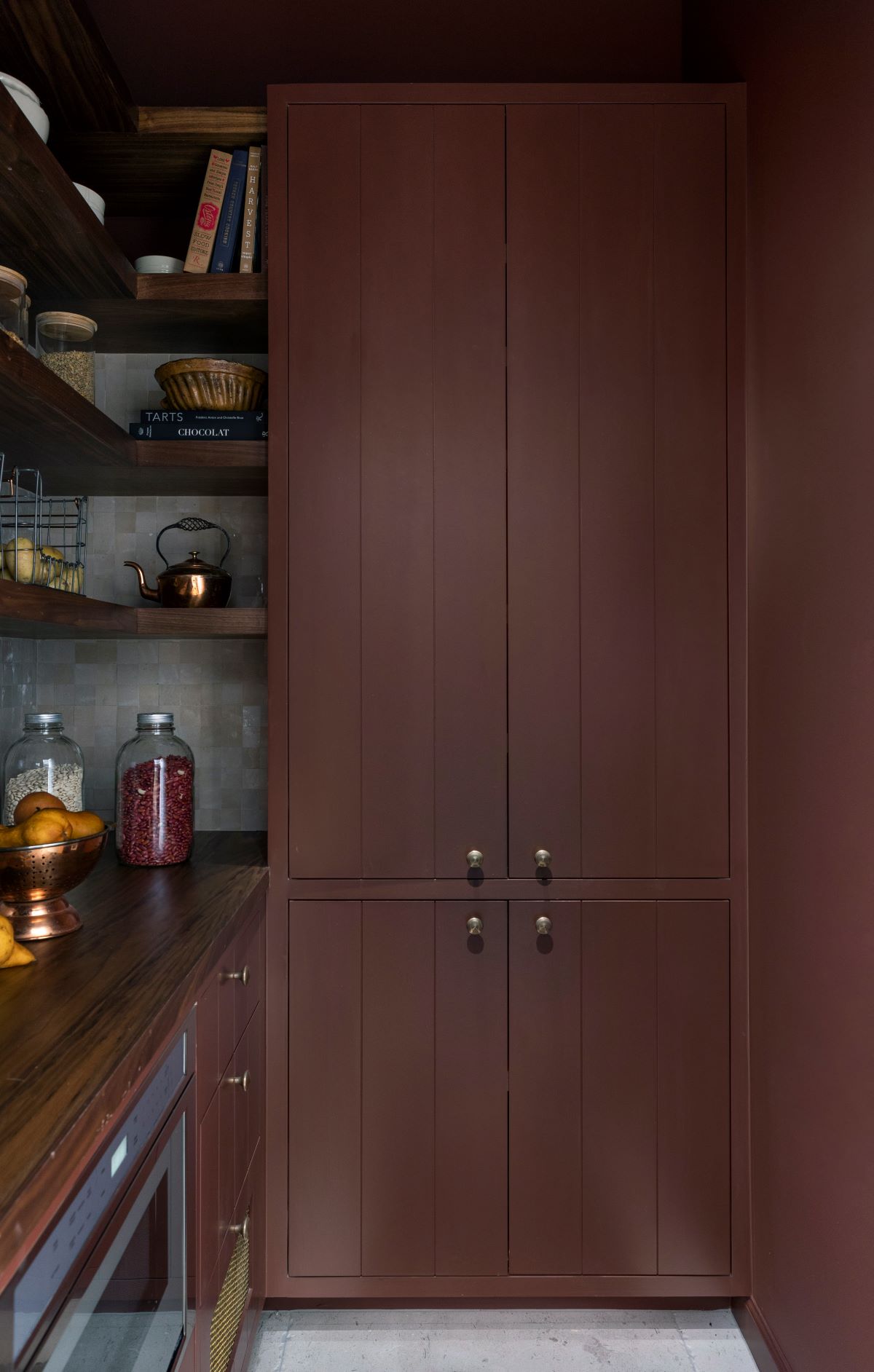
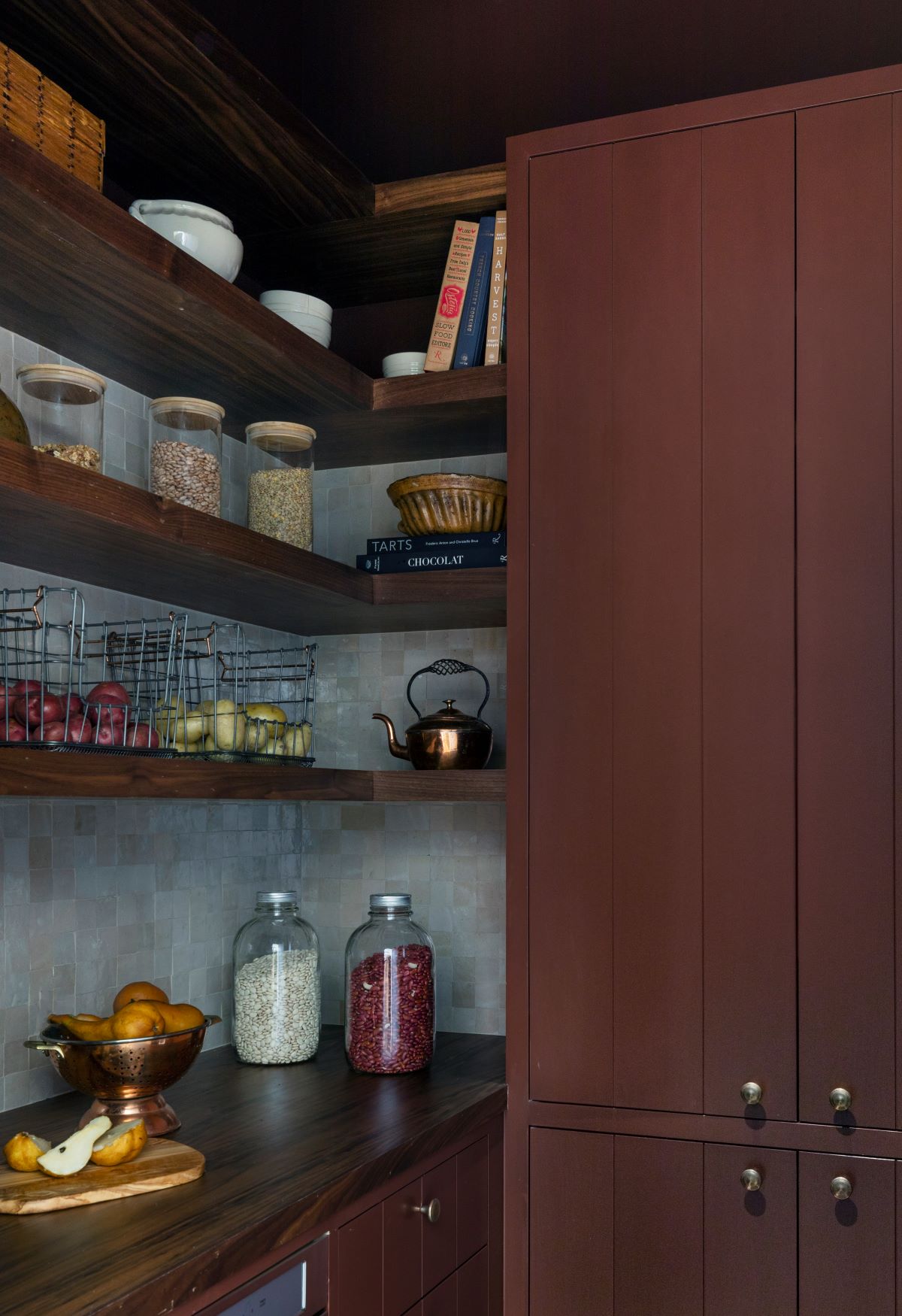
BUTLER’S PANTRY
I’ve mentioned how entertaining factored into a lot of my home’s design and the butler’s pantry provides extra space to house those necessities. I love a butler’s pantry or scullery because it’s a great spot for additional design fun, while being practical. First, I know you’ll want the paint color details and this one is Aurora Brown by Sherwin Williams (SW 2837). I loved the saturated color and how it pairs with the zellige tile. If you’ve been following me for a while, you know I love zellige. The undulated imperfection of zellige adds beautiful dimension and texture. I chose Zia Tile’s Glazed Earth 2×2 tile as the backsplash. The rich red of Aurora Brown paired perfectly with the different tones of the tiles and stained walnut shelving creates just enough juxtaposition in color. Also, you’ll notice the microwave is in the pantry, which was a nice way to save appliance space in my kitchen. Ultimately, this space supports my kitchen and I couldn’t be more pleased with how it functions.
Design Takeaway: When designing a butler’s pantry, think about what appliances and storage would best serve you in your kitchen versus a butler’s pantry. To conserve space, I didn’t want to have a microwave built into my kitchen island, so moving it to the pantry was an easy switch and gave more storage to the kitchen. I also included a tower that serves as my appliance garage for all the small appliances I didn’t want to leave on the counter. When designing homes for clients, I like to add larger appliances like ovens and fridges to clients pantries as well. Proximity is everything, so be sure the pantry is close enough to keep things convenient!
Design Sources:
- Paint: Sherwin Williams, Aurora Brown (SW 2837)
- Tile: Zia Tile, Glazed Earth 2×2
- Hardware: Roswell Cabinet Knob in Silicon Bronze Light
- Floors: Material Bespoke Paloma Limestone: French Quarter Finish
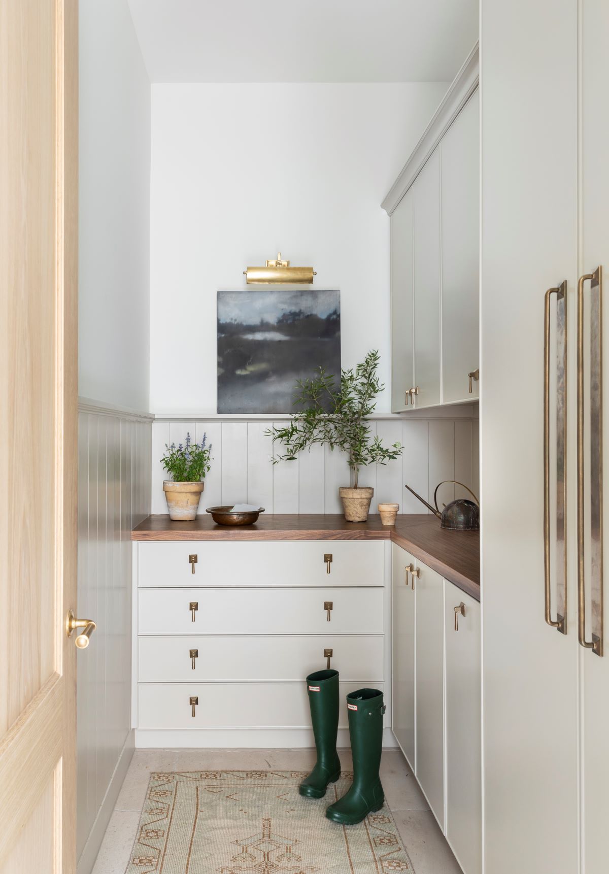
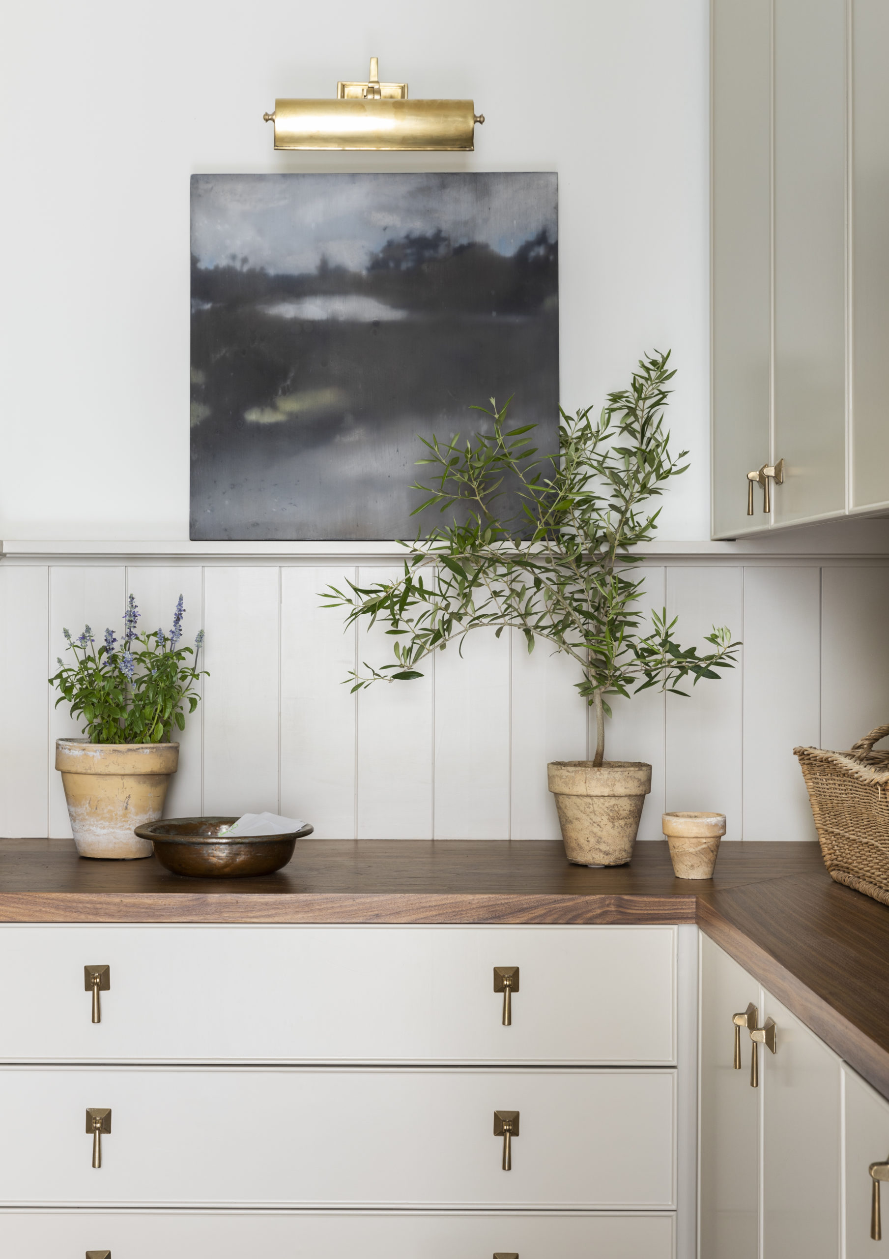
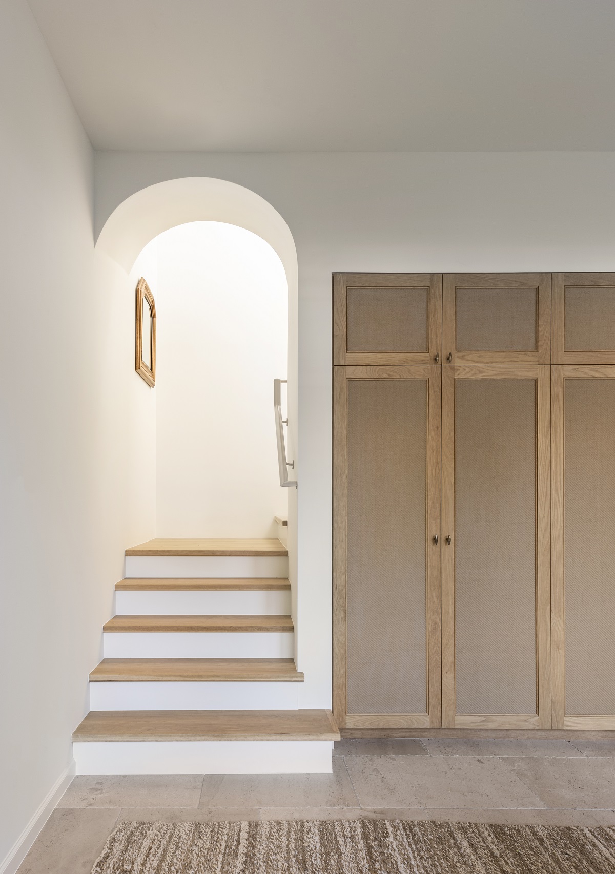
MUDROOM
Mudrooms have become a staple in new construction. There is something to be said for a room that houses book bags, extra shoes, sports equipment, necessities like paper towels and seasonal items…it’s a catch all for everything. I knew this space would house lots and lots of family items, so I wanted to make it light and bright. There’s nothing fun about a dark space loaded with the proverbial “stuff.” First, the wall paint color is Sherwin Williams Greek Villa (SW 7551) and the cabinetry color is Sherwin Williams Symmetry (SW 9601). I love the subtle difference between the two colors. I couldn’t resist the delicate Rocky Mountain Hardware pendant pulls and think they’re such a dainty touch in this space. In a nod to the butler’s pantry, the countertop is also a stained walnut. Be sure to come back in a few weeks for a peek inside the cabinetry and how it’s all organized for maximum mom-mode organization.
Design Takeaway: Support spaces don’t have to be extremely large to add lots of value to your home. You’ll notice that almost every square inch of this space serves a purpose. Not sure how to finagle your floor plan? Talk to your architect, builder or interior designer and come up with a way to maximize storage.
Design Sources:
- Wall Paint: Sherwin Williams, Greek Villa (SW 7551)
- Cabinetry Paint: Sherwin Williams, Symmetry (SW 9601)
- Hardware: Rocky Mountain, Empire Pendant Cabinet Pull in Silicon Bronze Light
- Hardware: Rocky Mountain Hardware, Empire Cabinet Pull in Silicon Bronze Light
- Artwork: Mary Hatch Case
- Art Light: Visual Comfort, Cabinet Maker’s Picture Light
- Floors: Material Bespoke Paloma Limestone: French Quarter Finish
I’ll be back next week with some of my storage and organization hacks for this space! Thanks for stopping bye.


")


[…] Our firm has worked with NEAT Method before and you may have read about them on a previous MFI blog. This time, it was my turn to enlist their services to organize these two spaces in a way that would serve my family. Today’s blog will focus on what’s behind the cabinet doors and how the layout and products work in tandem. If you want to see more about the sunroom and mudroom design elements, check out the full blog here. […]
[…] utility room. If you’re interested in exploring downstairs, you can find all the details here and here! Back to the tour. I’m excited to share some design tips and considerations I made for these […]
[…] exteriors. If you’re playing catch up, you can find the rest of the home tour in parts 1, 2, 3, 4 and […]